Using Python to analyze PE ratio and stock market performance
Category: data
Use Python to extract, clean and plot PE ratio and prices of SPY index as an indicator of American stock market.
Import Necessary Libraries
We will be using requests to get webpages; lxml to extract data; and then tranform raw data into Pandas dataframe
import numpy as np
import pandas as pd
import matplotlib.pyplot as plt

from datetime import datetime, timedelta
import requests
from lxml import html as HTMLParser
Get started with fetching and parsing raw data
Demonstration of use of requests and lxml
pe_url = 'http://www.multpl.com/table?f=m'
price_url = 'http://www.multpl.com/s-p-500-historical-prices/table/by-month'


def get_data_from_multpl_website(url):
    headers = {
        'User-Agent': (
            'Mozilla/5.0 (X11; Linux x86_64) AppleWebKit/537.36 '
            '(KHTML, like Gecko) Chrome/63.0.3239.108 Safari/537.36'
        )
    }
    res = requests.get(url, headers=headers)
    parsed = HTMLParser.fromstring(res.content.decode('utf-8'))
    tr_elems = parsed.cssselect('#datatable tr')
    raw_data = [[td.text.strip() for td in tr_elem.cssselect('td')] for tr_elem in tr_elems[1:]]
    return raw_data


pe_data = get_data_from_multpl_website(pe_url)
price_data = get_data_from_multpl_website(price_url)
# merged is the final merged raw data
merged = [[pe_row[0], pe_row[1], price_row[1]] for pe_row, price_row in zip(pe_data, price_data)]
# get first few rows
print(merged[:5])
[['Feb 16, 2018', '25.52', '2,732.29'], ['Feb 1, 2018', '26.30', '2,816.45'], ['Jan 1, 2018', '25.06', '2,683.73'], ['Dec 1, 2017', '24.70', '2,645.10'], ['Nov 1, 2017', '24.09', '2,579.36']]
Load data into Pandas, transform and plot
We first load into a dataframe. Date column needs to parsed to normal datetime types and PE and Price colums need to parsed to numeric values. The Price column contain comma and we need first get rid of these commas and then we can easily transform.
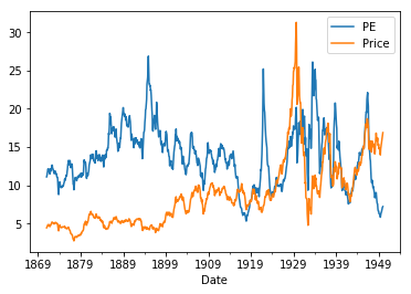
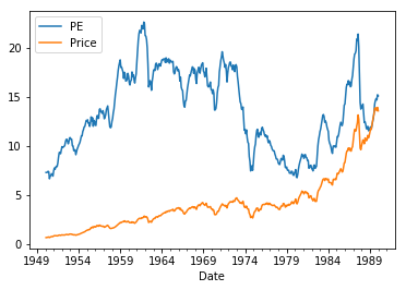
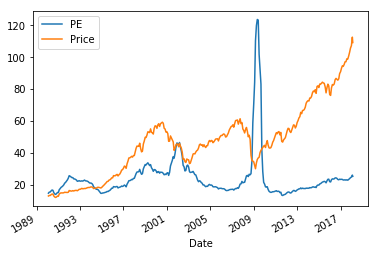
Then we split into three parts and display. The reason is that Price of SPY keeps rising in general from 1990 and there is spike of PE ratio in 2009 (I searched online and did not find much explanation. It is just like an incident – financial reports during that season are just so bad). For each part we do necessary scaling to fit two lines into one graph.
The final step is to plot and caculate correlation.
df = pd.DataFrame(merged, columns=['Date', 'PE', 'Price'])
# parse date formats
df.Date = pd.to_datetime(df.Date, format='%b %d, %Y')
# transform to numeric values
df.PE = pd.to_numeric(df.PE)
df.Price = pd.to_numeric(df.Price.str.replace(',', '').astype(float))  # handle commas inside strings
df = df.set_index('Date')

df1 = df.loc[df.index > datetime(1990, 1, 1)]
df1.is_copy = False
df1.Price = df1.Price / 25

df2 = df.loc[(df.index <= datetime(1990, 1, 1)) & (df.index > datetime(1950, 1, 1))]
df2.is_copy = False
df2.Price = df2.Price / 25

df3 = df.loc[df.index <= datetime(1950, 1, 1)]
df3.is_copy = False
df3.Price = df3.Price

df3.plot()
df2.plot()
df1.plot()

print(np.corrcoef(df3.PE, df3.Price))
print(np.corrcoef(df2.PE, df2.Price))
print(np.corrcoef(df1.PE, df1.Price))
print(np.corrcoef(df.PE, df.Price))
    [[1.         0.03910522]
     [0.03910522 1.        ]]
    [[1.         0.10271352]
     [0.10271352 1.        ]]
    [[ 1.        -0.0355023]
     [-0.0355023  1.       ]]
    [[1.         0.43079017]
     [0.43079017 1.        ]]
Any conclusion?
To be honest I do not see anything out of these charts. Some article [like this(https://www.kansascityfed.org/Publicat/econrev/pdf/4q00shen.pdf) and our correlation does supports the idea there should be reasonnable correlation between PE ratio and stock price. But if we look at short term stock market performance, for example 2009 June and July spike, the historically high PE ratio did not cause any drop in stock market.
Stock market performance surely does not depend on one single factor and such a simple model cannot capture all the changes of market performance. So is current stock performance too good to last? I am not sure. Guess I can only answer this after one year.
Notes:
- All raw data come from MULTPL